
Most of the types are followed by codes indicating the data formats supported and the curve fits available.
Data formats:
| A: | X,Y,X,Y,X,Y... |
| B: | X,Y,Z,X,Y,Z... |
| C: | X,Y,Xe,Ye,X,Y,Xe,Ye... |
| D: | Label,Y,Y,Y,Y... |
Note that type D may have a date rather than the label. Graphs which only accept type D data will assume the label to be blank if it is not present.
Curve fitting codes:
| N: | No fit. (Omitted when other fits possible.) |
| B: | Join with Bezier curve (Cosmetic). |
| L: | Straight line fit. |
| Q: | Quadratic (second order) fit. |
| C: | Cubic (third order) fit. |
The sample pictures shown below are reduced JPEGs from copies of A4 landscape Draw files.
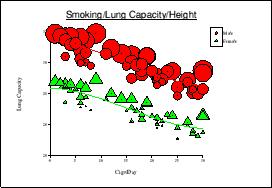
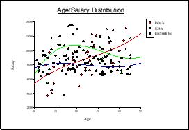 | Scatter ChartThese charts are useful for showing statistical sample data. Each data set is given a different coloured and shaped point for clarity. Formats: AD Curves: BLQC |
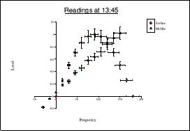 | Scatter with error barsThese are similar to scatter charts but allow error rates to be shown. Extra data pairs give the error rates as values (not percentages). Formats: C Curves: BLQC |
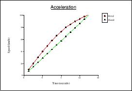 | Line GraphSimilar to a scatter chart but with the points joined, this is the most popular scientific graph. Formats: AD Curves: BLQC |
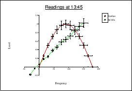 | Line Graph with error barsThis is similar to a Scatter chart with error bars but has the points joined by straight lines. Formats: C Curves: BLQC |
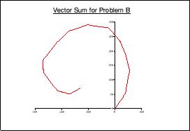 | Vector DiagramThese treat X data as angles (in degrees) and Y data as lengths, but plot the results on a rectangular co- ordinate system with an arrow at the end of each one. Measure will show both rectangular and polar readings. These charts are useful for vector arithmetic (see also Argand Diagram). Formats: A Curves: N |
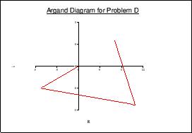 | Argand DiagramThese plot X,Y data but plotting each point relative to the previous one, with an arrow at the end of each line. They are normally used, with the Y axis representing factors of the square root of -1, as an aid to complex arithmetic. They may also be used for vector arithmetic where the X,Y components of the vectors are the known values. Formats: A Curves: N |
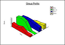
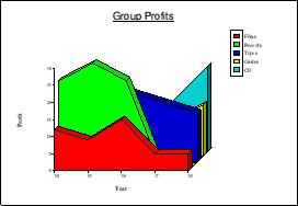 | 3D Area ChartThis is an attractive way of presenting simple figures. Note that it is not possible to take accurate measurements from a 3D chart. Formats: AD Curves: N |
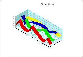
 | Ribbon ChartThis is similar to the 3D area but without the fills under the lines. Formats: AD Curves: N |
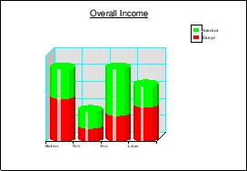
 | Isometrlc 3D Area ChartThese are the same as 3D area charts but with an isometric projection. Some data will be easier to see in this format. Formats: AD Curves: N |
 | Isometric Ribbon ChartSimilar to an Isometric 3D Area chart but with the areas under the lines not filled. Formats: AD Curves: N |
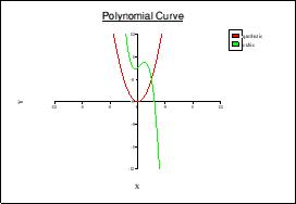 | PolynomialPolynomial charts allow curves to be plotted for polynomials up to the fifth order, where the coefficients are known. The data format is unique to this graph type as each line of the data table contains the coefficients of the terms of a polynomial, in ascending order of power, separated by commas. There are no statistics for this graph. |
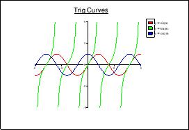 | ExpressionExpression graphs also have a unique data format. Each line of the data table contains an expression preceded by an = symbol to identify it. The expressions are of the form f(x) and are used to plot the curves on the graph. No statistics are available. |
 | Bubble ChartSimilar to scatter charts, these display an extra dimension by allowing the marker size to be controlled. Formats: B Curves: BLQC |
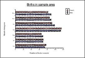
 | Kite DiagramGenerally used by biologists, these give a good view of sampled data along a position or time axis. Turning the key off gives labels on the right hand Y axis. Formats: AD Curves: N |
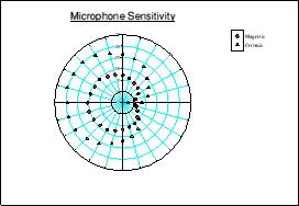 | Polar Scatter ChartThis is similar to a scatter chart but used for angular data. X data are treated as angles (in degrees) and Y data as radii. Formats: A Curves: B |
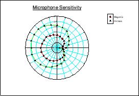 | Polar Line GraphSimilar to Polar Scatter but with consecutive data points joined by lines. Formats: A Curves: B |
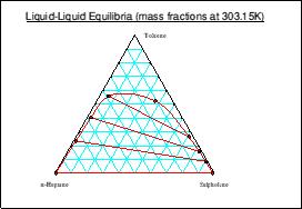 | Triangle ChartAlso known as Ternary diagrams these are used to represent the distribution of a third component between two liquid phases that are immiscible in certain concentrations. Each apex of the triangle represents 100% for a component, and compositions at any point on the chart can be measured. Data should be supplied as percentages or fractions with the points in order along the envelope. Q and C type fits may be tried but are not often useful. Formats: B Curves: BLQC |
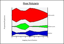
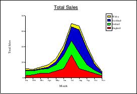 | Stacked Area ChartEach data set becomes an area stacked on the previous one to show an accumulated total for each point on the X axis. Formats: D Curves: N |
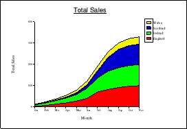 | Cumulative Stacked Area ChartSimilar to a stacked area chart but consecutive Y values are summed to provide a running total. Formats: D Curves: N |
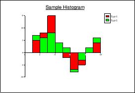 | HistogramUsed to represent frequency distributions for statistical analysis. The data are provided as co-ordinates for the top left corner of each ‘bar’ plus an extra X value for the top right corner of the right-most ‘bar’. Formats: A Curves: LQC |
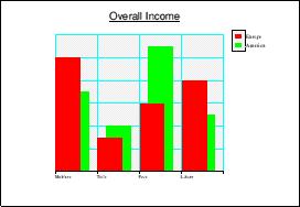 | Bar ChartA popular presentation chart which also gives accurate representations of data. Formats: D Curves: LQC |
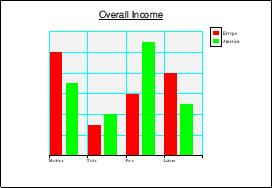 | Spread Bar ChartThis is similar to a bar chart but the columns in each group are placed side- by-side rather than overlapping. Formats: D Curves: LQC |
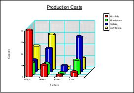
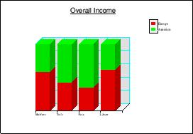
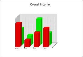 | 3D Bar ChartAlso similar to a bar chart but uses an orthographic projection. This improves presentation but makes it difficult to take accurate readings. Formats: D Curves: N |
 | Column ChartThis is similar to a 3D bar chart but with cylindrical columns for a different presentation. Formats: D Curves: N |
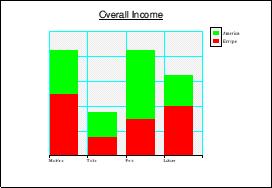 | Stacked Bar ChartIn this bar chart, the data sets are placed above each other to give a representation of total values. Formats: D Curves: N |
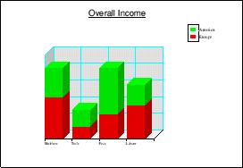 | 3D Stacked Bar ChartThis is an orthographic projection of a stacked bar chart. Formats: D Curves: N |
 | Stacked Column ChartSimilar to a 3D stacked bar chart but with cylindrical columns. Formats: D Curves: N |
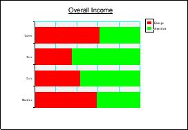
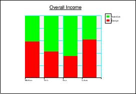 | Percentage Bar ChartThese bar charts are similar to stacked bars with each bar scaled to fit the Y Axis which is marked from 0 to l00%. This shows the percentage makeup of the sections of each bar, in a similar way to a pie chart. Formats: D Curves: N |
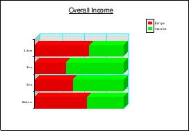
 | 3D Percentage Bar ChartAn orthographic projection of a percentage bar chart. Since it will only ever be one row deep, accurate readings can be taken off the ‘front’ face. Formats: D Curves: N |
 | Percentage Column ChartA 3D percentage bar chart with cylindrical columns. Formats: D Curves: N |
 | Picture ChartSimilar to a Spread Bar Chart but using a Draw file to illustrate the bars. Formats: D Curves: LQC |
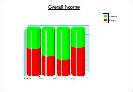
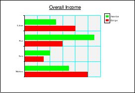
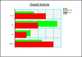 | Horizontal Bar ChartThese are the same as bar charts but with horizontal ‘columns’. Formats: D Curves: N |
 | Horizontal Spread Bar ChartThe same as a spread bar chart but in a horizontal format. Formats: D Curves: N |
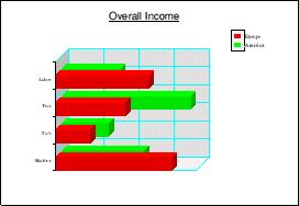 | Horizontal 3D Bar ChartThe same as a 3D bar chart but in a horizontal format. Formats: D Curves: N |
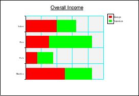 | Horizontal Stacked Bar ChartThe same as a stacked bar chart but in a horizontal format. Formats: D Curves: N |
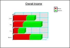 | Horizontal 3D Stacked Bar ChartThe same as a 3D stacked bar chart but in a horizontal format. Formats: D Curves: N |
 | Horizontal Percentage Bar ChartThe same as a percentage bar chart but in a horizontal format. Formats: D Curves: N |
 | Horizontal 3D Percentage Bar ChartThe same as a 3D percentage bar chart but in a horizontal format. Formats: D Curves: N |
 | Horizontal Picture ChartThis is the same as a Picture Chart but in a horizontal format. Formats: D Curves: N |
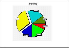 | Pie ChartPie charts show data as sectors of a circle, giving proportional rather than absolute values. Negative data cannot be represented so any negative values will be shown in exploded sectors (see illustration). Note that only one dataset may be represented and no statistics are available. Formats: D Curves: N |
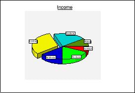 | 3D Pie ChartSimilar to a pie chart but in a 3D projection. Formats: D Curves: N |
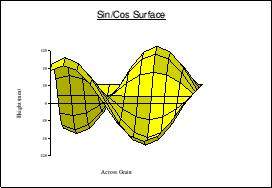 | Surface ChartFor these charts data sets are placed in consecutive positions on the Z axis with each data item in consecutive positions on the X axis (like a 3D bar chart). The Y values are all super-imposed on this grid to draw a shaded 3D surface in an orthographic projection. A special format is used in the input file as the data table contains only Y data. The available statistics are very limited. |
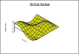 | Isometric Surface ChartThis is the same as a surface chart but in an isometric projection. |
![]()